The latest Tiddly Inks challenge is All about Boys, featuring cards that scream 'boy'.
I've been combating the idea of what is 'boy' and what is 'girl' lately, especially with a couple of my young friends. Granted, they are both quite young and still trying to figure out what it means to be a boy or a girl.
Then I saw a comment on the Tiddly Inks FB group from someone who didn't realize that there were Tiddly Ink boy stamps and that changed my thinking to embrace the challenge as is without bending anything.
Now, this still is somewhat gender neutral, but if we're going with stereotypes, aliens are a bit more 'male' than 'female': I often get surprised looks when I share that I like science fiction and my husband does not...
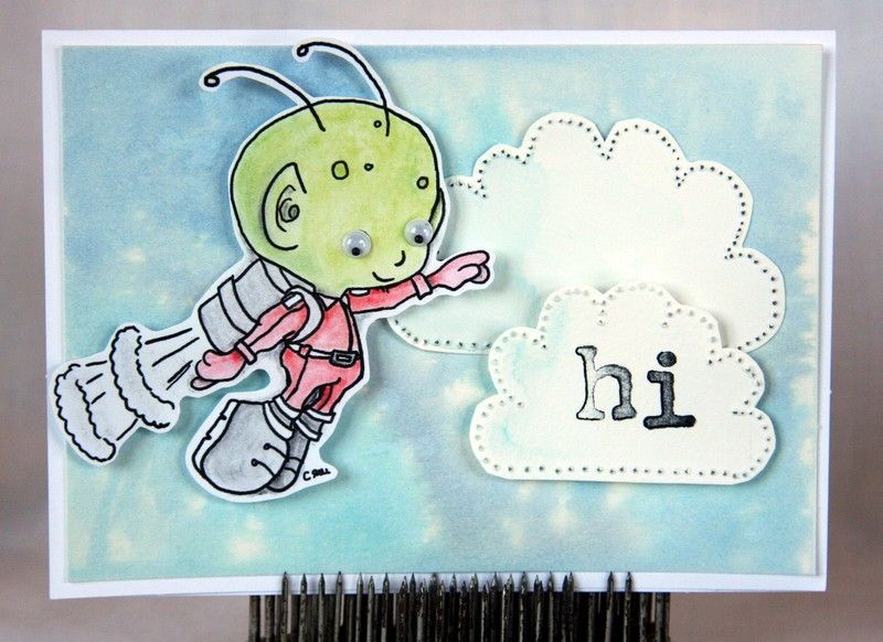
I got to try a couple techniques out with this card (as well as buy that cute alien) that have been sitting on my Pinterest art board for a while now. The first will take a little more practice--you wet a piece of watercolor paper, then dab on Distress Ink with a wet paintbrush. The ink didn't disperse as I wanted it to, and the tape holding down my paper curled up immediately. Perhaps I need to use the blue or yellow tape, not the green tape.
The second item was to 'reverse punch' something using my paper piercer. This worked great to outline my clouds and I'm glad to finally check that off as something easy, but really effective.
Showing posts with label tiddlyinks. Show all posts
3.28.2015
1.23.2015
frosty feeling
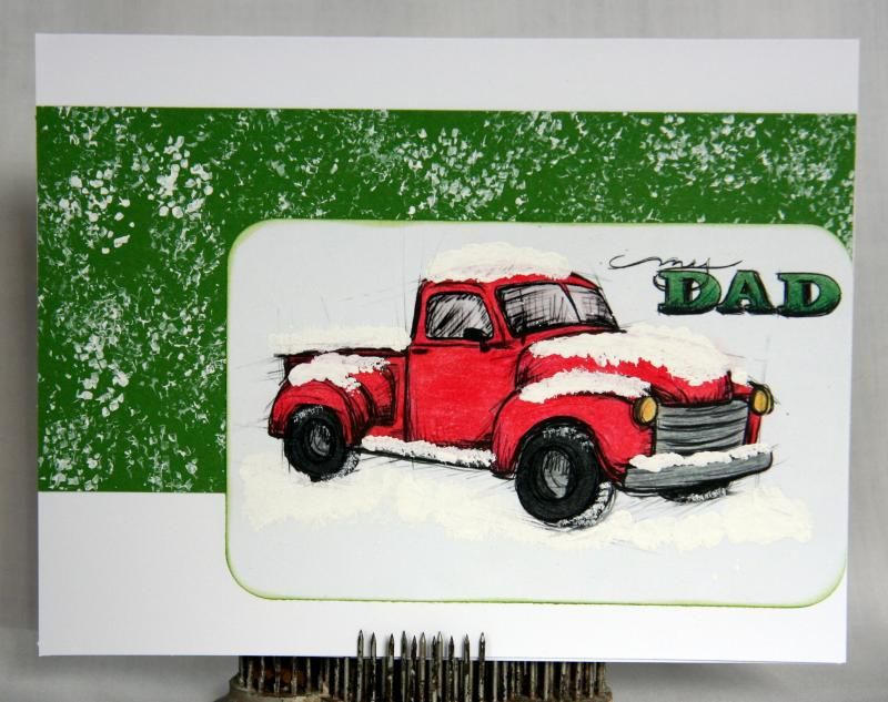
Goodness, but it's been a long time since I've done a card challenge!
The Frosty Challenge over at Tiddly Inks piqued my interest immediately, though, and I knew at once what I wanted to do.
I printed out the truck, pulled out my colored pencils, Gamsol and white paint and set to work. It's really nice when a plan comes together.
I decided to pull in a bit of green, despite the Christmas-y feel it gives with the red truck (and snow), and I think it turned out nicely. I debated between embossing the green cardstock or just making it snowy, settling on the snow effect (obviously) to keep things simple and focused on the truck.
I'm debating going in and adding a little more white paint to a few spots on the snow, as close-up you can see through it...
12.16.2014
modus
I like coloring with colored pencils.
Until recently, my method to get a smooth look was to color, erase a layer and then add another layer of color on top. I have now moved onto something new: Gamsol (or an artist grade mineral spirits).
This stuff is like magic, and I've only just gotten started--the cardstock here is super cheap, as are my blending stubs*. I also am still getting the hang of how to color first so the look is completely blended.
In both sets, the image on the bottom is colored, then erased, and the image on top is colored, then blended with the Gamsol. I'm especially pleased with how skin tones are going to turn out using the mineral spirits!
I will still use the 'old' technique when I'm wanting a distinct look or the image lends itself to pencil lines. I also haven't tried black yet, to see what that would look like and if it will be a result I prefer.
*Apparently you want the kind made in Taiwan, not China.
9.05.2014
poppy
The new Tiddly Inks challenge is to use a Pop of Color (featuring poppies!) on a card. I've been needing to make a birthday card for over a week now, and I know the birthday girl likes orchids. So I pulled up the orchid image, printed it, then pulled out my acrylic paints to 'poppy-fy' it.
I kept everything very clean and simple--no vintage edges, no heavily distressed pieces. The background paper was embossed with a folder and then lightly inked with Distress Ink to make the impression pop.
7.24.2014
teeny
I recently realized that there are a lot of card challenges I haven't done in a while, including the One Layer Challenge. Perhaps some of this is because I've found a couple new challenges and only have time to complete one or two a month!
One that I have been enjoying is the Tiddly Inks biweekly challenge. This round is all about things small! I knew immediately I wanted to make some MOO cards and got to work figuring out exactly how and which image.
I settled on using one of the clear sets I recently purchased and stamped Ellie on a piece of watercolor paper I had colored with Distress Inks and then spritzed with water. Then I trimmed the paper to MOO size:
As before, I decided this would be cute on a card with the background image as one color. I stamped Ellie in Vintage Photo and then layered the MOO piece on top, using a piece of dimensional tape to have her pop out a bit.
I also uncovered an already printed piece on my desk as I was working, and decided to see how the suitcases would work as a MOO card. Here's how it's shaping up so far:
One that I have been enjoying is the Tiddly Inks biweekly challenge. This round is all about things small! I knew immediately I wanted to make some MOO cards and got to work figuring out exactly how and which image.
I settled on using one of the clear sets I recently purchased and stamped Ellie on a piece of watercolor paper I had colored with Distress Inks and then spritzed with water. Then I trimmed the paper to MOO size:
As before, I decided this would be cute on a card with the background image as one color. I stamped Ellie in Vintage Photo and then layered the MOO piece on top, using a piece of dimensional tape to have her pop out a bit.
![]() |
| Gah! Where did that splootch come from? |
I also uncovered an already printed piece on my desk as I was working, and decided to see how the suitcases would work as a MOO card. Here's how it's shaping up so far:
6.06.2014
pastel
The latest challenge from Tiddly Inks (the blog) is to create using pastels. I browsed my folder of images and decided Melissa Birthday Bear is perfect for something soft!
I don't generally work in this color scheme, and I generally don't use my Pastels to color images (chalk isn't very stable and they're quite messy), so this was good for my brain.
The purple is a little dark for a pastel challenge, but I was really wanting to just get this card done so I could move on to playing around with the truck stamp that was just released! I think she's cute and will probably use her again for a get well card, and maybe even a congratulations card.
I left the chalk that 'bled' outside the bear on purpose, hoping it makes her look even softer.
4.24.2014
whatsis
Time for a roundup of all the random things going on in my head and stuff I've found around the Internet!
- Because it was recently the Easter season, and because my pastor discussed the raising of Lazarus a few Sundays ago, when I was browsing Tiddly Inks stamps, the Mummy one made me think it could be Lazarus! I might just have to buy that one and create that idea...
- Have you seen The Honest Toddler blog? I recently found the Dinner Translator post and it's hilarious!
- You only need to watch fifteen seconds of the Jubilant Dog to be happy and laugh uproariously. But watch the whole thing. Really. Do it.
- On Pinterest? Here's a worthy cause: Pin a Meal from Land o'Lakes. More details at their website (which you can find on that board).
- I did my second Rithmatist program at the library today, and the girls that attended tuned me into a really fun steampunk band: Steam Powered Giraffe.
4.10.2014
yummilicious
I hesitated to join another challenge, especially since I barely get the ones I already follow done these days, but the Tiddly Ink Facebook challenge piqued my interest. So I joined the group and then started brainstorming.
The theme is 'something yummy', so I first browsed the Tiddly Ink images I have and settled on Patriotic Wryn.
Because she's not obviously eating, or tempting you to eat, I decided I need to focus on what kinds of food that she evokes. Hot dogs immediately came to mind. Then lemonade. Jell-O. Ice cream. Pickles. Baked beans.
Picnic and barbecue food!
She is colored with colored pencils and has some clear Stickles on the sparkler and hair piece. I made her pop out with dimensionals. The food along the side is from a digital freebie I got a while ago (can't remember the source--sorry!). The picnic blanket paper is from my stash and I made the grass with Mowed Lawn Distress Ink and watercolor paper.
2.28.2014
primarily
I've been itching to get another Tiddly Inks challenge done, but my mojo left the building for a few days*.
Today I decided to just play with it and see what happens. The challenge for this round is primary colors. I had printed out a bunch of the Lilli Claire images, hoping they would be a big hit at Christmas. And I think they would have been, too, if I had actually gotten my act together and colored them!
So here she is in red, yellow and blue! I used colored pencils to color her and the candy cane, then used a die cut frame and stamped some lines for a bit more pattern in the background (masking so they wouldn't leak out of the frame).
*Did you see my DCM post about a bunch of half finished cards? Yeah, they're still sitting half finished...
1.24.2014
tag it
Tiddly Inks challenge time! This round features any image on a tag, so I pulled out the snowman and got to work.
I used the large size tag (#8), folded up the bottom portion to be a holder, stamped the carrots and glued the edges. Then I dabbed white paint on the bottom portion, used a dimensional piece to glue on the snowman and voilá! A gift card holder that's perfect for anything wintery!
12.24.2013
11.22.2013
sweet lilli
It's an Anything Goes challenge over at TiddlyInks! I've been eyeing up several new digis, but the one I'm using today wouldn't get out of my head, so I bought her.
Here she is in light blue jammies.
The stamp in the background is my own.
Here she is in light blue jammies.
The stamp in the background is my own.
9.24.2013
arrivederci
I've been itching to use the suitcase stack I got from TiddlyInks and finally got a card pulled together--just in time for the Saying Goodbye challenge! (did you go to the link? isn't Baker Wryn adorable!?) I pulled out my colored pencils and went for an autumnal color scheme, thinking this would be great for that college-student-send-off moment!
I also used Distress Inks and a Tim Holtz stamp set to complete the card, especially the inside:
I originally had a page of a book in the background, but there wasn't enough color with that, so I switched it out for a green patterned strip of paper. This also makes it a little more generic, so it could be for a new job or a new house/state/city/etc.
ETA: I just had a thought that a map background would be fun... I may have to go try this!
8.29.2013
reenter
The newest Tiddly Ink challenge is Back to School! I debated between doing something with the stacked suitcases or the little school house, and went with the building. The layouts that kept happening with the luggage didn't convey 'school', rather they were more about a journey or adventure.
So I used colored pencils (again--seems to be my favorite with these images!) and then lots of odds and ends of things.
Can I admit something here? I don't like this card. Now, that doesn't mean it's horrible or that others won't like it. I love the image and how the color turned out, but overall, I just don't like it. But there's not time to do something else...
8.06.2013
treat
The latest challenge for Tiddly Inks is to do something sweet!
It may come as no surprise to regular readers that I went down the ice cream road...
I took the ice cream cone I made previously and layered it onto a piece of cardstock sponged with the same Distress Ink colors as the ice cream (Aged Mahogany and Worn Lipstick), which was then put on a white card base.
I also added a few Frosted Lace Stickles to the cherry:
I think I may add these to the shop, they're so cute!
7.25.2013
bites
In honor of National Ice Cream Month, I've been making all sorts of ice creams (and frozen treats), including some of the paper variety!
Astute readers will have noticed the fun photo in that post linked above, wishing they, too, could make one of these extremely cute ice cream cones*. Wonder no longer, for I have a tutorial for you!
Start by printing two sets of your ice cream cone, one on white cardstock and the other on tan/kraft/brown cardstock.
Then cut off the ice cream portion on the white cardstock. This is the part you'll color.
I decided to color mine with Distress Ink and sponges, to get a softer looking ice cream. You may color however you wish: crayons, markers, paint, etc. I needed to block off my cherry so it wouldn't get colored, so I masked it with a piece of cut paper. Then I used Worn Lipstick and Aged Mahogany to turn this into a strawberry (or cherry) flavor.
Once it's done, you're ready to cut! I didn't worry about the stem on the cherry, knowing it would still appear on the base cardstock layer. Then I colored my cherry with paint to really make it pop, then set the whole thing aside to let it dry.
In the meantime, I added a little dimension to my cone. You can do this however you like: colored pencil, crayon, etc. I used the Vintage Photo Distress Marker and a water pen.
Be sure you're ready with the water pen right away here to soften edges--this is regular paper, not watercolor paper! Draw a little bit, then swipe it with the water pen. Do this again, until you've reached the desired darkness of shadows.
Now adhere your ice cream to your cone.
I rounded off my corners, though this would still look fabulous with straight points.
Then I decided it needed a little pizzazz. So I added some flourishes with a black marker and some dots with that same marker. To finish, I added a couple of white dots.
And violá! A beautiful ice cream cone that won't melt before you can enjoy it! Stick this on the front of a card and mail it to an ice-cream-loving friend. Or pop it on yet another piece of cardstock and stick it in a frame and hang it. Your ice cream choices are endless, and you could create a whole wall of cones!
*Drawn by Christy of TiddlyInks.
5.17.2013
patriotic
So the next WIST theme is Red, White and Blue. I was stumped for a while, and then a challenge to use any Wryn image over at Tiddly Inks popped up in my FB feed...
Thinking there had to be something I could adapt to fit the Team WIST challenge, I started scrolling through the images.
Suddenly, there she was.
Patriotic Wryn.
I bought her immediately and printed out a card-sized version of her and got to work. Because she's a little 'sketchy', I knew colored pencils would be perfect for this round. I'd like to try crayons, too, though I might have to do a lot of sharpening for that... or print her bigger.
Still plotting on the background, I added clear Stickles to the sparkler and let everything sit for a day.
The background needed to be simple, as I wanted the attention on Wryn, so I thought making some red, white and blue stripes would be the most effective. I toyed around with adding more (or subtracting: using the star puncher on the blue), but in the end, knew I had to stick to simple. I also decided to keep her flat, rather than popping out, thinking she would still stand out from the background.
Man, she's cute!
3.26.2013
modify
Have you seen Tiddly Inks? Cute stuff--I finally found the perfect curly-haired girl for a wood shaving project I've been wanting to do for about a year now. (What? You didn't see that? It's on the Stamp n' Stitch FB page...)
Christy recently gave a free digital image to all the FB fans and I finally got around to printing and coloring it!
I decided beforehand that I wanted to print the deer on kraft and do a bit of paper piecing with this, so I had to print this twice. Well, three times, since I could fit two images on one sheet of white. This turned out to be fortuitous, as my markering (yay! making up words!) mojo had left the building... and no, I don't own Copics.
Those birds also really called for bright pops of color, so I pulled out paints to get them to the right shade. Then some cutting, some pop squares and a little green marker grass!
I'm thinking some of these projects won't work as cards, so I'll have to start making wall art... like nursery decor, etc.
Subscribe to:
Posts (Atom)